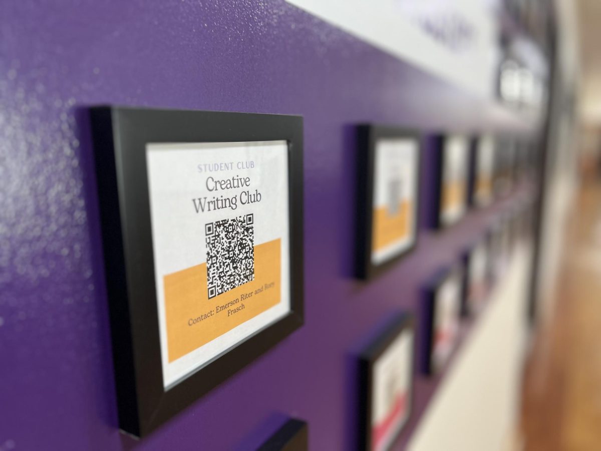
While passing through the first floor of Masters Hall, I noticed a wall, once plastered in colorful posters advertising various student clubs with glitter glue and collages, now replaced by rows and rows of QR codes. Examining the wall, I quickly grew bored of contemplating where the QR codes might lead (if only I had my phone) and began looking a little more carefully at the labels for each one.
That’s bizarre:
One of the framed codes was missing a label, there were no names indicating the club or leaders. Another few club codes did feature student names — just spelled wrong. GALS club omitted the last name of the leader and just read: Kendall. I remember Kendall: she graduated last year.
The bizarre array of club codes with misspelled names and inconsistent titles is a new feature of Masters Hall this year, and the change came quietly. Although Jeff Carnevale, dean of students, declined to comment on the intention behind the wall, the codes fit into what I have noticed to be a developing theme at Masters: Modernity.
The emphasis on modernity in recent Masters projects is certainly evident. The IEC building contains impressive technological features within its angular structure. The Fonseca Center, a previous project, boasts glass windows stretching to the ceiling of the gym, and cold metal stools lining the hall. The QR code wall is not nearly as impressive.
Technologically wise, the QR codes are limited. QR stands for ‘quick response’, but of course, how quick can the response be if students have to wait until 3:05? Moreover, QR codes are too old to be novel. The modern touch of adding a digital element to the wall is already dated.
On a larger scale, omitting the technological aspect, modern styles are often lifeless. On its best days, modern decor and architecture can be seen as “sleek” and “minimalistic”, but typically the effect is drab and sparse.
To that effect, the wall is certainly modern. Any evidence of human interaction, or student passion, was chucked over the summer and replaced with cold, function-fits-form codes. Why are we so quick to replace the warmth and color that adorned Masters Hall with monochromatic codes?
Of course, that question is half-rhetorical. The previous club advertisements were busy and chaotic in aesthetics and certainly messy in some areas. But the history of Masters isn’t clutter.
I have my own opinions about the aesthetic design of the IEC, but at least it added to campus rather than replaced. Moreover, the building was thoughtful. In contrast, the wall appears like a quick cover-up of what was deemed not good enough.
Modernity is inherently a little egotistic, arguing that the minimalistic present is better than the accumulated past. And as we know, the present can feel very stark and bleak. Let our spaces on campus feel warm and cozy, let them feel cheerful. Let them feel fun.
Even when colors clash, or clutter reigns, the solution isn’t apathetic design. The scratched and written-on Harkness tables, the random assortment of paintings and posters hanging in classrooms on the second floor, the stained-glass windows: Masters may be imperfect, and it may be unpolished, but this school exhibits signs of life and excitement in every class and doorway and office. Don’t let QR codes take that away.


